The MTA creates a lot of data while executing its operations—from every train, every bus, every turnstile. On the Data & Analytics team, our tasks are centralizing, transforming, and understanding this data. The key thing? Speed. We need actionable insights about yesterday, today.
Today’s blog post tells the story of one of those tasks: bus matching.
Background
A long time ago, in 2014, BusTime was released. BusTime is a system that logs every MTA bus’s location every 30 seconds. Immediately, we started using BusTime to improve the customer experience. When you open your preferred transit app and see the next bus coming—that’s BusTime, baby.
To get that number to you, BusTime must decide what route each bus is on while it’s in motion. This is known as an online model: it must make decisions as data comes in. There are a few problems with this data, as seen in Table 1.
Data source |
Issues |
|---|---|
Bus headsigns |
Drivers may enter incorrect codes. |
Bus schedules |
Buses often run off schedule to meet rider demand. |
Route GPS patterns |
Buses do off-route detours. |
While a bus is on a route, BusTime doesn’t have access to the full set of pings on that route, since the bus hasn’t yet finished its route. As such, BusTime relies on headsigns (the signs on the front of buses listing their routes and destinations) and schedules for this decision. Because of the issues listed in Table 1, these can be incorrect.
Our goal is to have next-day bus performance metrics. Things like bus speeds, customer wait times, and trip crowding help our planners better address service shortages. This is unlike the in-motion use case: our team has access to the full trajectory of data from yesterday, including GPS data. GPS data is powerful because we don’t need to make as many assumptions about the driver or schedule. If we used the BusTime trips, we’d have to exclude some trips from metrics, due to bad routing. But exclusions are more likely during disrupted service—the exact situations we want to understand!
Enter bus matching: the new basis for bus performance metrics at the MTA. By making use of the full set of data, as well as known patterns in our bus routes, bus matching splits our pings into trips on those routes.
The data
Alright geeks, it’s the part you’ve been waiting for.
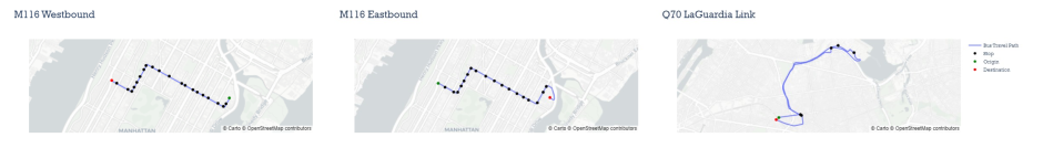
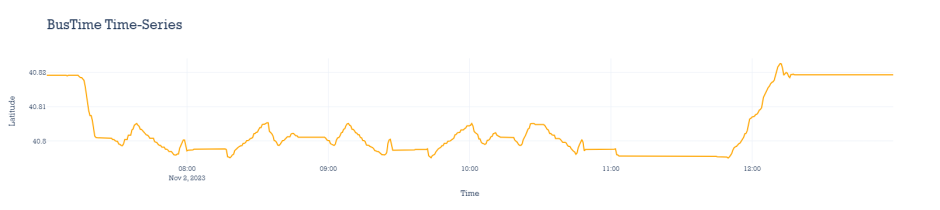
The MTA operates nearly 6,300 buses, of which around 4,300 run service on a given day. The BusTime pings from a bus might look like Figure 2.

The bus is going back and forth over certain streets, likely in service on a route. It also travels to and from a depot.
There are a lot of pings here: up to 2,880 per bus per day (or per ‘bus day’). Multiply by 4,300 daily buses, and this becomes a Big Data problem. During preliminary research, we found that it takes 30 minutes for a person to split one bus day, associating sequences of pings to trips on our routes. There are better uses for our tax dollars—we needed a solution that would scale to our full bus fleet.
The first step in automation is enumerating all routes. For that, we turned to GTFS. The General Transit Feed Specification (GTFS) represents a transit agency’s entire schedule in eight CSV files. These include routes, trips on the routes, stops on the trips, and calendars for which these are relevant. You can download the MTA GTFS files here.
For this project, the key data are route shapes. Shapes are geometric realizations of routes: lines on New York City streets with a start and end point. Some routes like the M116 have just two shapes, corresponding to two bounds. Some have more. Loop routes have just one.
The trip splitting algorithm
Now that we have data, we’re ready to split pings into trips. For the sake of explanation, let’s focus on a single bus day of pings like Figure 2.
A bus day is a time series: a set of data indexed on time. An example is shown in Table 2. Because we have latitude and longitude, this is a multidimensional time series.
Time |
Latitude |
Longitude |
|---|---|---|
2023-11-02 07:08:36 |
40.8192 |
-73.9585 |
2023-11-02 07:09:06 |
40.8190 |
-73.9579 |
2023-11-02 07:09:36 |
40.8192 |
-73.9576 |
2023-11-02 11:44:41 |
40.7955 |
-73.9330 |
2023-11-02 11:45:11 |
40.7954 |
-73.9331 |
2023-11-02 11:45:42 |
40.7954 |
-73.9331 |
On a plot, it’ll look like Figure 4. Note that we only plot latitude. This’ll make it easier to explain how we’re processing these. Just know that everything uses both dimensions.
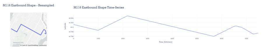
We also have shapes from GTFS. To use them, we must convert shapes into time series. We do so by taking 250 samples along the shape path, arbitrarily assigning 30 seconds between each, as seen in Figure 5.
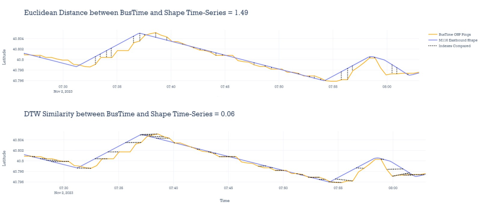
You probably see some similarities between the series. Good intuition! We use that similarity. Specifically, we use a signal processing algorithm called dynamic time warping (DTW).
In addition to having an excellent name, DTW returns a similarity metric between input time series. A similarity metric is a number representing a relationship: a larger value means two series are more different. In our context, if the DTW metric between route and pings is low, that’s likely a trip on that route.
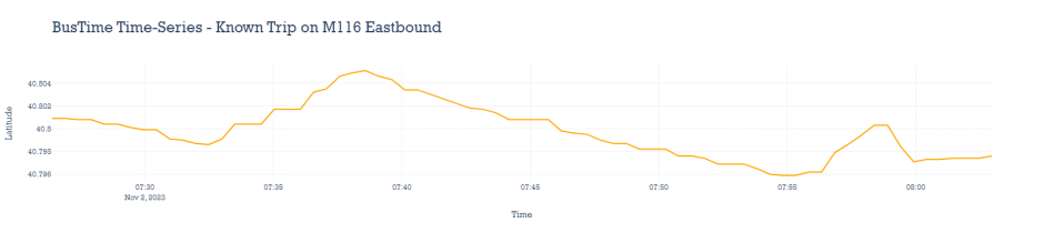
The “warping” part is key. Let’s look at a time series that we already know indicates one trip on the eastbound M116. You’ll note that this doesn’t match exactly—the bus pauses at some times and goes faster at others.
In a standard Euclidean distance between two time series, you line up values by index and calculate a root squared sum of corresponding values. Even a small pause can mess up your metric. On the other hand, the DTW similarity matches data on the time index in a way that minimizes the difference. Essentially, it allows skipping pauses or detours (up to a parameterized limit).
An explanation of how DTW works is beyond this post’s scope, but we like this primer. If you’d like to try it, we used this package.
Now we’re ready for trip splitting. First, we limit the set of shapes considered to routes the bus was near. We iterate through each of these shapes. We use DTW to find the stretch of pings that best corresponds to a shape. When the match is close enough (i.e., the similarity is within a parameterized threshold), we claim those pings for that shape and don’t consider it for future matching. We repeat the process until our best match is above threshold. Then, we move to the next shape. This divides our pings into trips. Success!
Or is it? How do we confirm accuracy? This is where manual tagging comes in. By comparing our results to the decisions of experts from our Bus Schedules team, we can iteratively adjust the algorithm parameters until we’re confident the process is performant.
By the way, trip splitting is just one step in bus matching. We calculate metrics for the trips and write outputs to a database. We won’t go into these in detail here (we have a word limit to meet), but we promise they were all developed with love and care.
Parallel processing using Azure Batch
Automating was a big win, now taking one minute of computation. But that’s still slow; over a day for all buses in a day. We can’t provide next-day bus metrics like this.
The concept of bus days wasn’t just for this blog post. It also presents an obvious key for parallelization. Imagine if we had 4,300 laptops. Each could run one bus day, and we’d be done in a minute.
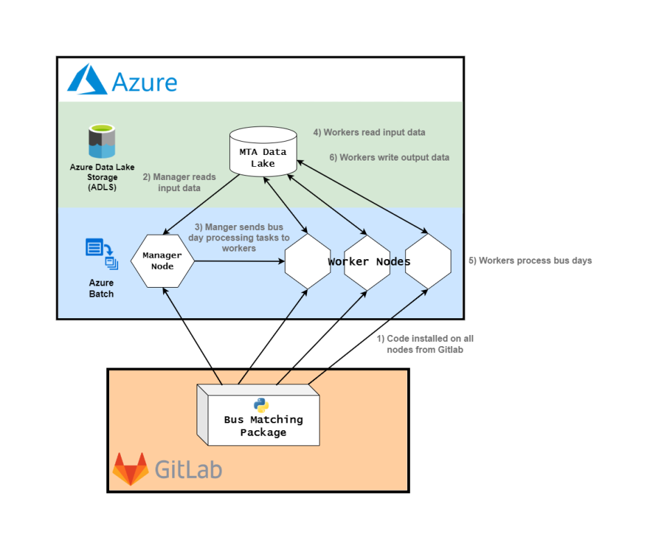
We have something that requires much less table space: Azure, Microsoft’s cloud platform. We make use of Azure in two ways. First, we store data in Azure Data Lake Storage (ADLS): raw pings, raw shape data, and our outputs.
The second is Batch. Batch is a scalable job scheduling engine. It manages virtual machines (nodes) and their processing (jobs). In our current architecture, to process a given day, we have one node that has one job: identify the set of buses that ran yesterday. It then creates a job to process each of those bus days using bus matching, which it sends out to 31 others.
The trick is that the processing—querying ADLS, running trip splitting, performing metric calculation, and writing the outputs to ADLS—was developed in a Python package. By allowing the nodes to download and install our package from version control, we give them all the functionality needed.
The diagrams in Figure 8 demonstrate our current bus matching architecture.
Conclusions
What a ride! This was a broad overview of a data pipeline, making use of open data, fun algorithms, and cloud computing to efficiently build next-day metrics about our buses.
As mentioned earlier, we’re working on getting the full outputs for this data into our open data offering. As a teaser, the express bus capacity dataset was built off bus matching and is ready for analysis.
If you have questions about anything here, please email opendata@mtahq.org.
About the author
Gayan Seneviratna is a data scientist with the Data & Analytics team.